SNAKAT
Brand Identity

SNAKAT is a visual identity project for a snack brand created to bring flavor, joy, and energy to everyday moments. The identity was designed to feel bold, playful, and instantly recognizable across packaging, stickers, social media, and branded materials.
SNAKAT is a visual identity project for a snack brand created to bring flavor, joy, and energy to everyday moments. The identity was designed to feel bold, playful, and instantly recognizable across packaging, stickers, social media, and branded materials.
Client :
Mr. Hussein Bamzahem
My Role :
As the Art Director and Brand Identity Designer, I developed the creative direction, custom logo style, color system, patterns, and brand applications for SNAKAT. My role was to turn the brand’s playful snacking experience into a lively, memorable, and flexible visual identity.
As the Art Director and Brand Identity Designer, I developed the creative direction, custom logo style, color system, patterns, and brand applications for SNAKAT. My role was to turn the brand’s playful snacking experience into a lively, memorable, and flexible visual identity.


Explore the full story –
The Challenge
The challenge was to create a snack identity that feels fun and energetic without losing clarity or brand consistency. SNAKAT needed a visual system that could stand out on packaging and digital platforms while communicating flavor, movement, fun, and youthful energy.
The challenge was to create a snack identity that feels fun and energetic without losing clarity or brand consistency. SNAKAT needed a visual system that could stand out on packaging and digital platforms while communicating flavor, movement, fun, and youthful energy.
Concept & Strategy
The concept was inspired by street art, expressive lettering, and colorful dessert sprinkles. I used bold custom typography, dynamic shapes, and vibrant colors to create a logo that feels spontaneous, flavorful, and full of movement while remaining strong and recognizable.
The concept was inspired by street art, expressive lettering, and colorful dessert sprinkles. I used bold custom typography, dynamic shapes, and vibrant colors to create a logo that feels spontaneous, flavorful, and full of movement while remaining strong and recognizable.
Final Outcome
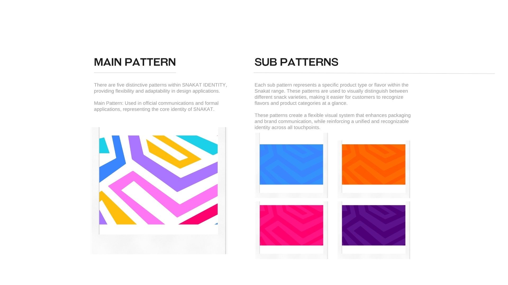
The final identity presents SNAKAT as a playful and energetic snack brand with a strong visual personality. The system includes custom typography, color variations, flavor-based patterns, packaging elements, stickers, social media layouts, and digital applications that create a consistent and joyful brand experience.
The final identity presents SNAKAT as a playful and energetic snack brand with a strong visual personality. The system includes custom typography, color variations, flavor-based patterns, packaging elements, stickers, social media layouts, and digital applications that create a consistent and joyful brand experience.