NAPTA
Product / Packaging Design

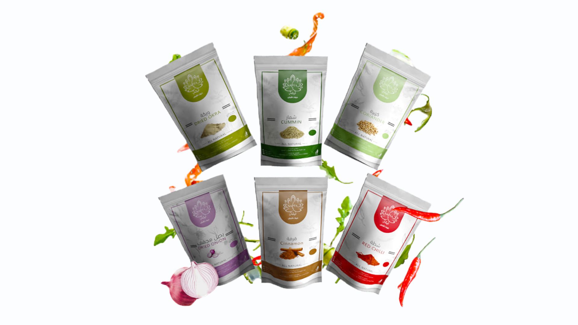
Nabta is a packaging design project for a specialized store offering Sudanese products in Doha, Qatar. The name is inspired by the Nabta Kingdom, meaning “Land of Gold,” giving the project a cultural foundation connected to heritage, origin, and value.
Nabta is a packaging design project for a specialized store offering Sudanese products in Doha, Qatar. The name is inspired by the Nabta Kingdom, meaning “Land of Gold,” giving the project a cultural foundation connected to heritage, origin, and value.
Client :
Nabta
My Role :
As the Graphic Designer and Packaging Designer, I developed the product packaging visuals and brand presentation for Nabta. My role was to translate the Sudanese cultural reference into a clean product design that feels authentic, warm, and commercially presentable.
As the Graphic Designer and Packaging Designer, I developed the product packaging visuals and brand presentation for Nabta. My role was to translate the Sudanese cultural reference into a clean product design that feels authentic, warm, and commercially presentable.

Explore the full story –
The Challenge
The challenge was to create packaging that reflects Sudanese identity without making the design feel outdated or overly traditional. Nabta needed a product look that could communicate heritage, quality, and cultural value while remaining suitable for a modern retail environment.
The challenge was to create packaging that reflects Sudanese identity without making the design feel outdated or overly traditional. Nabta needed a product look that could communicate heritage, quality, and cultural value while remaining suitable for a modern retail environment.
Concept & Strategy
The concept was built around the idea of origin, land, and gold. I used a warm visual direction, cultural naming, and product-focused packaging language to create a design that connects Sudanese heritage with a clean and accessible market presence.
The concept was built around the idea of origin, land, and gold. I used a warm visual direction, cultural naming, and product-focused packaging language to create a design that connects Sudanese heritage with a clean and accessible market presence.
Final Outcome
The final packaging direction presents Nabta as a culturally rooted and recognizable product brand. The design gives the products a clearer visual identity, supports shelf appeal, and communicates authenticity through a modern packaging approach.
The final packaging direction presents Nabta as a culturally rooted and recognizable product brand. The design gives the products a clearer visual identity, supports shelf appeal, and communicates authenticity through a modern packaging approach.